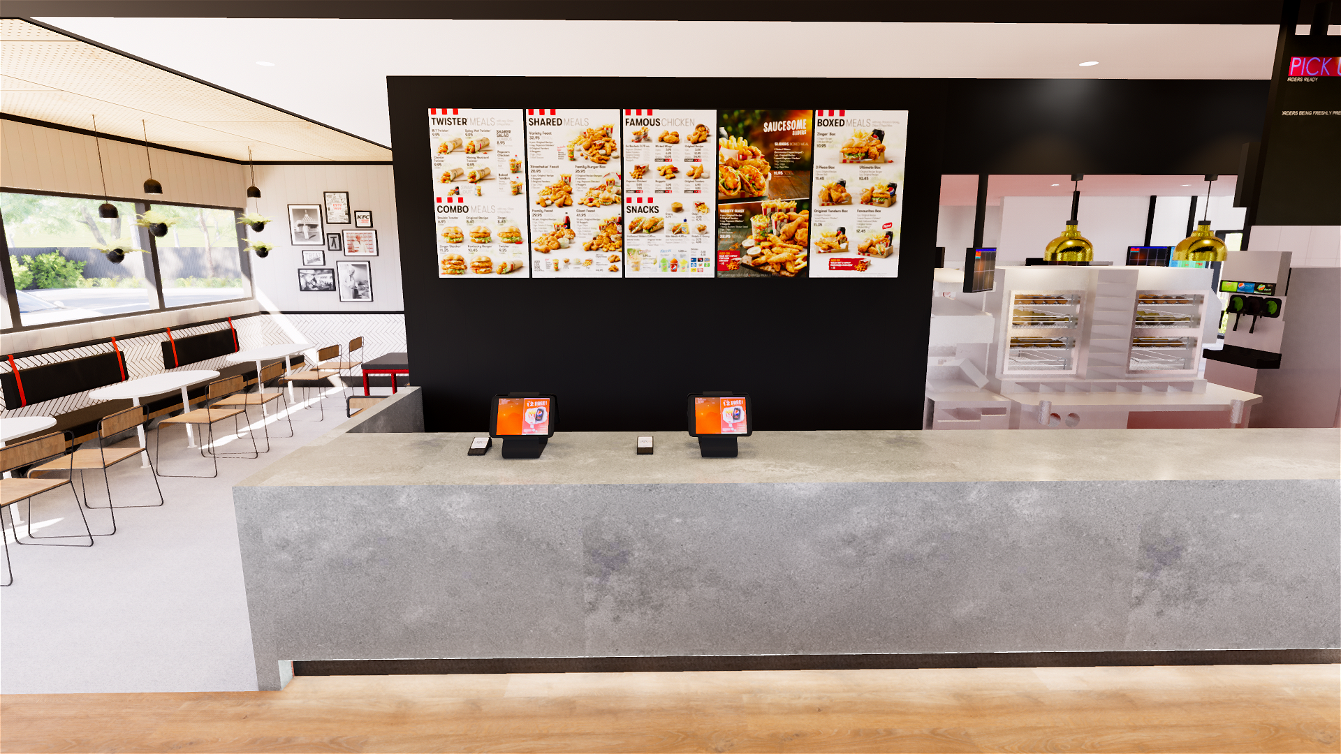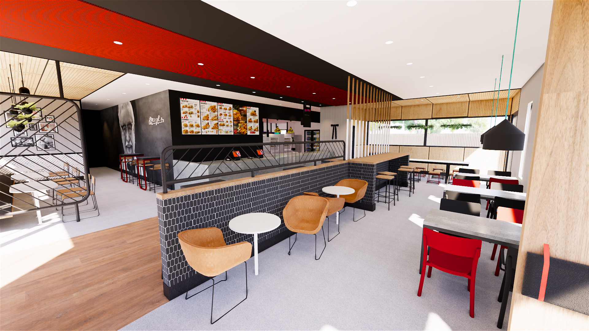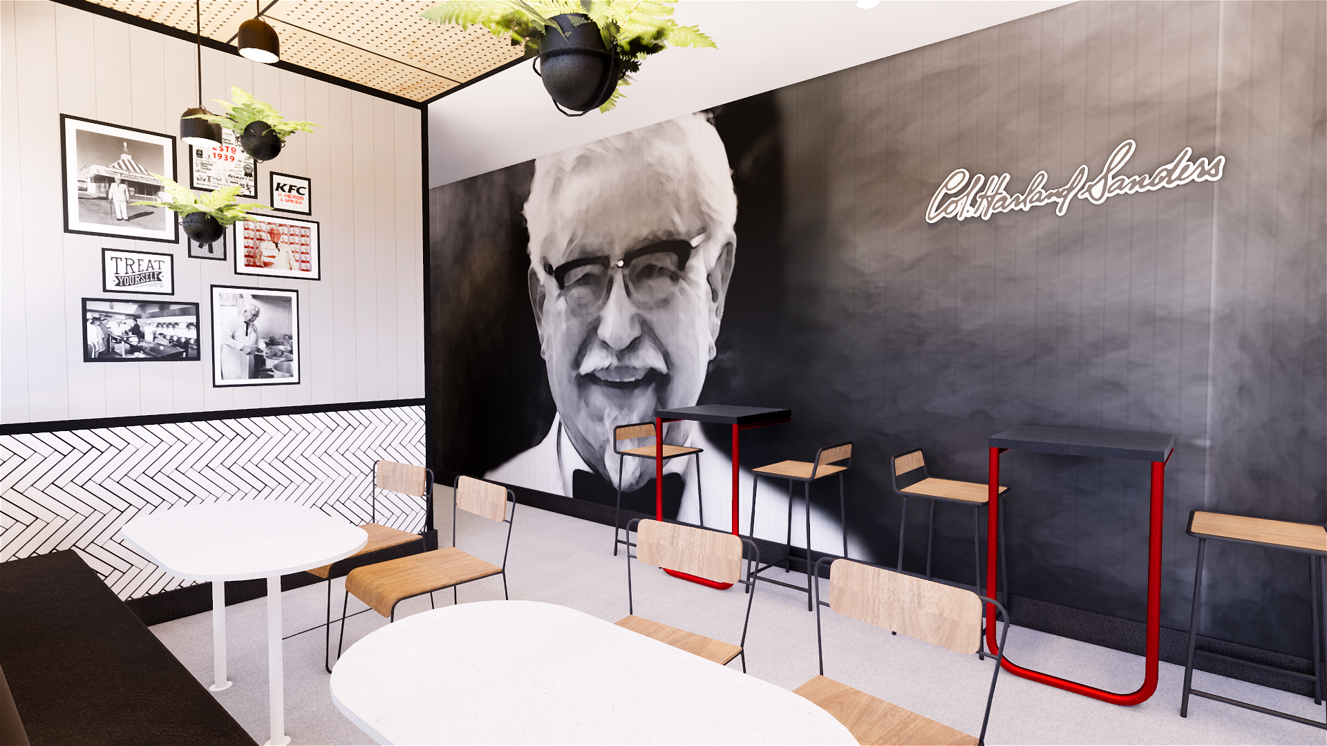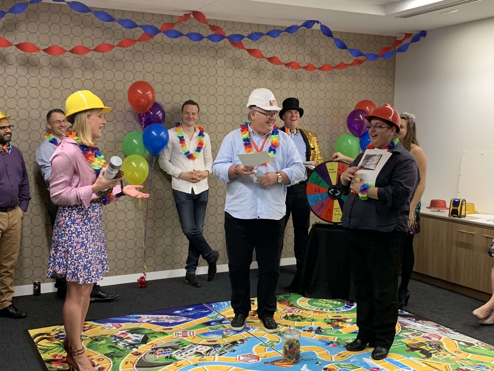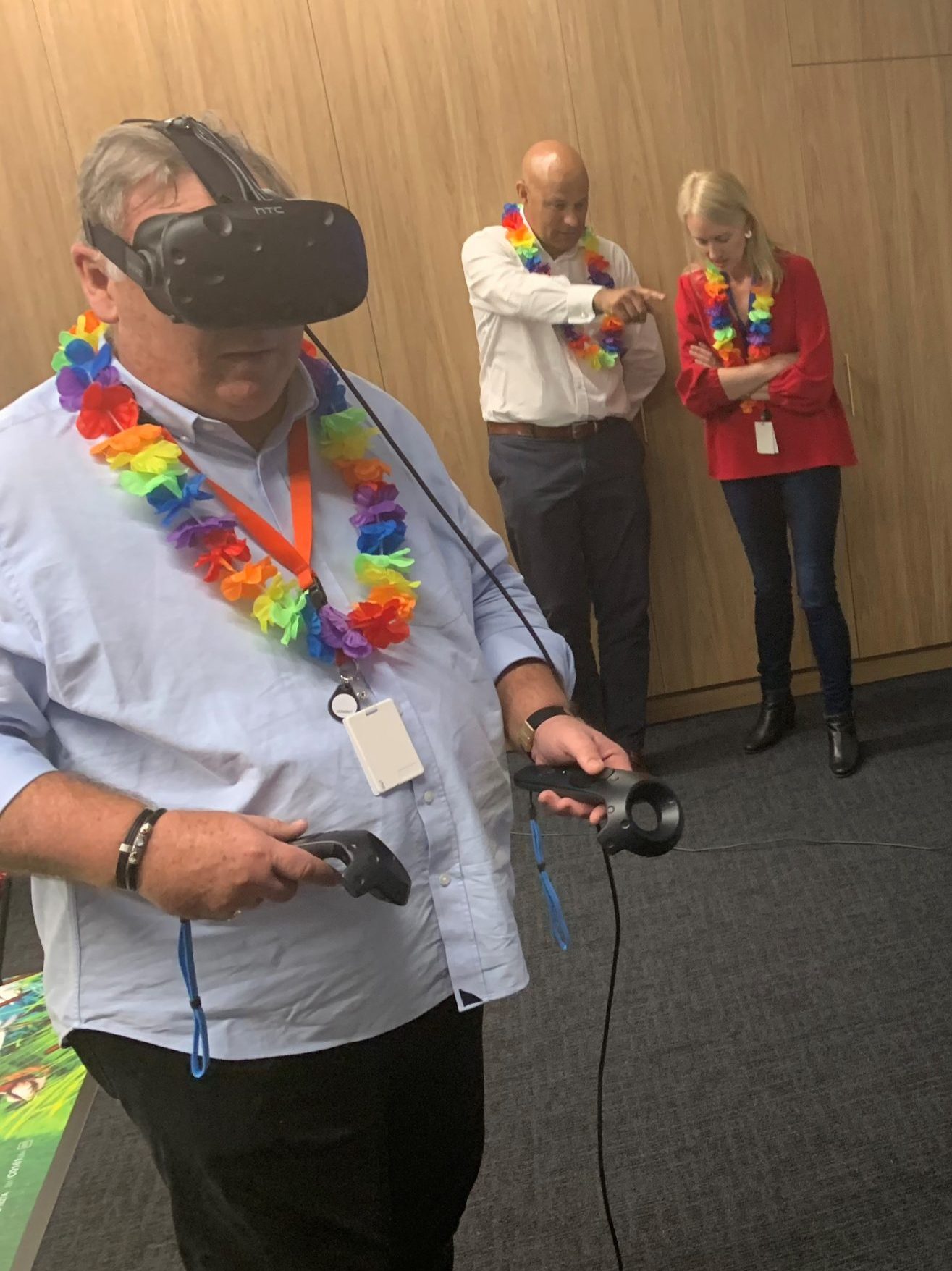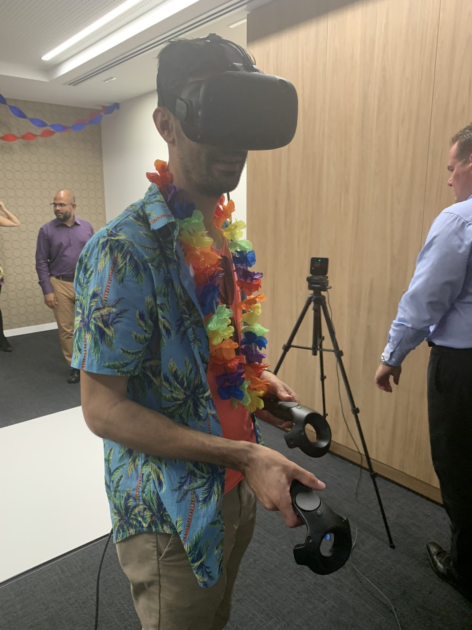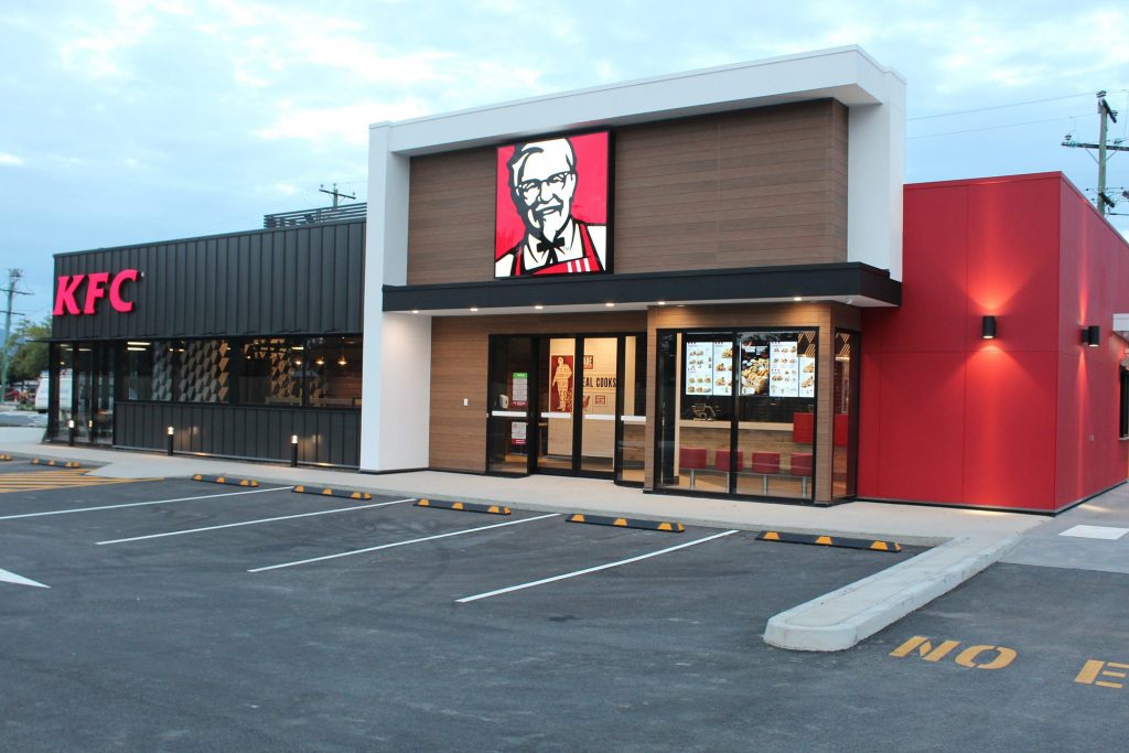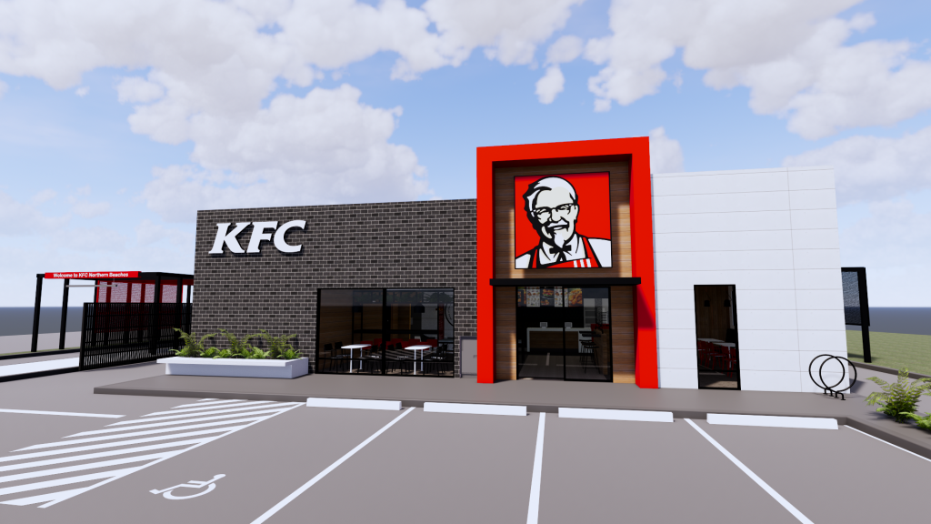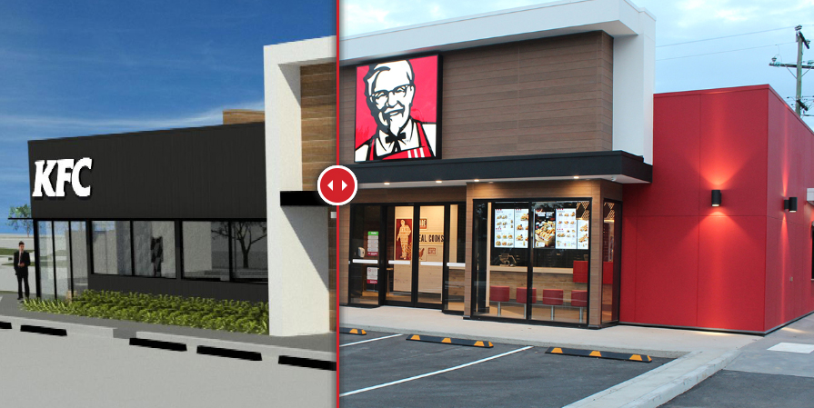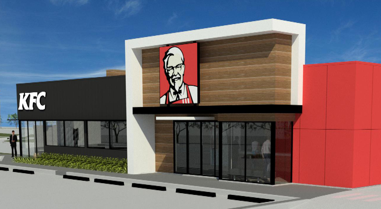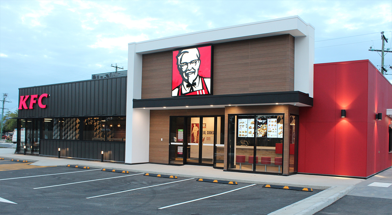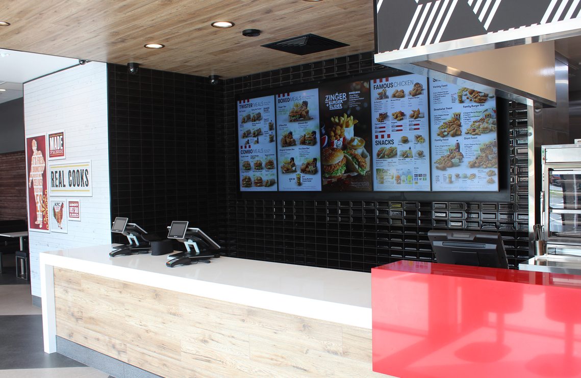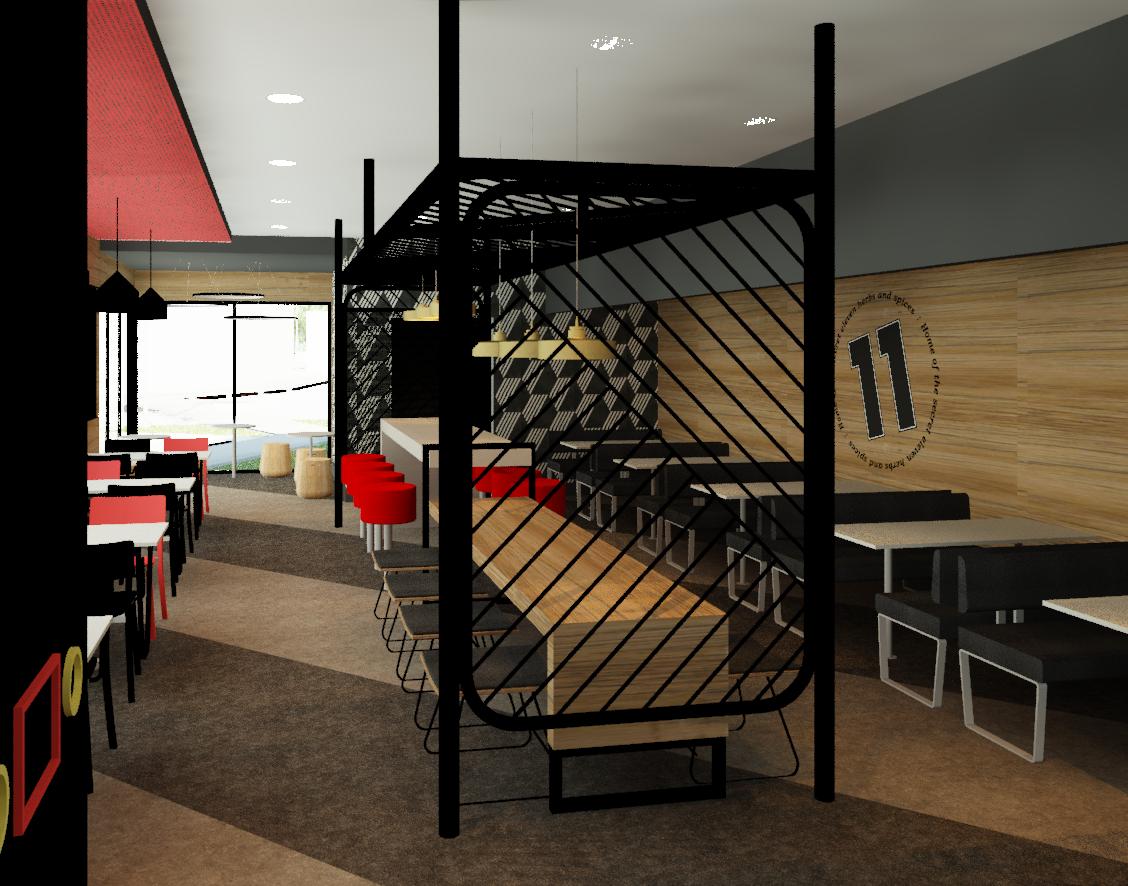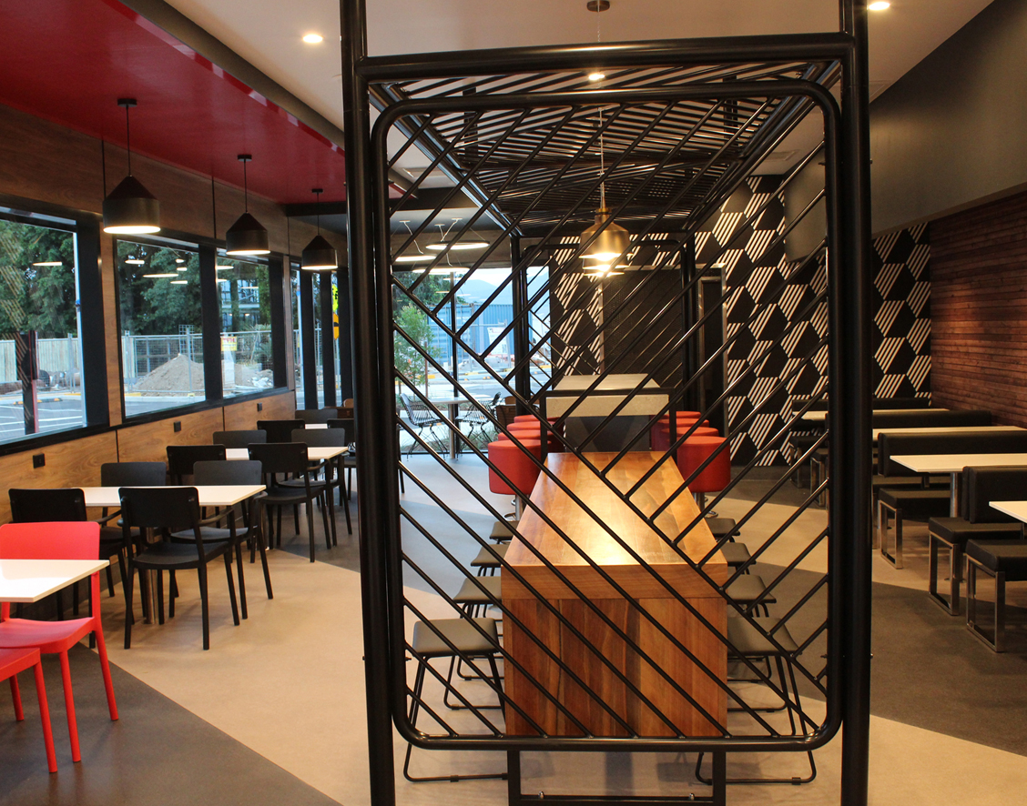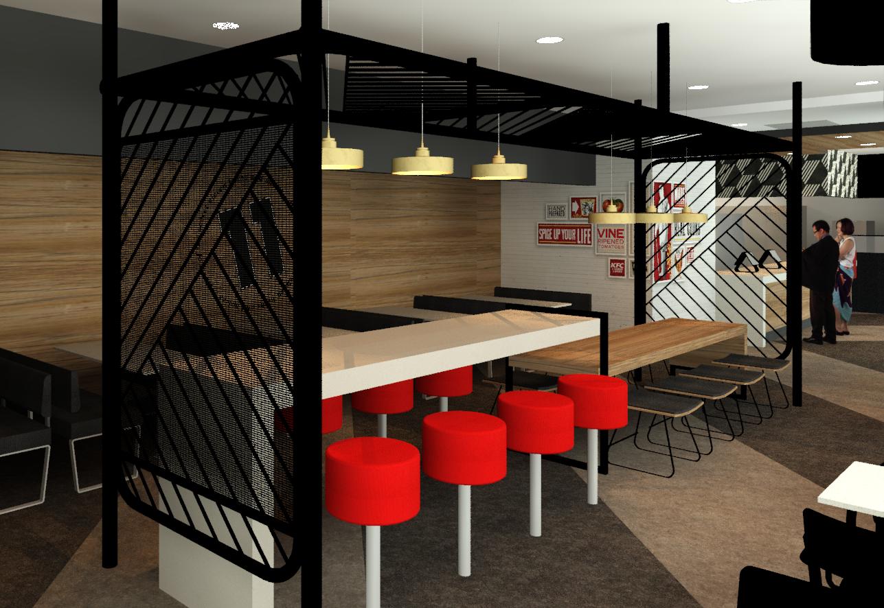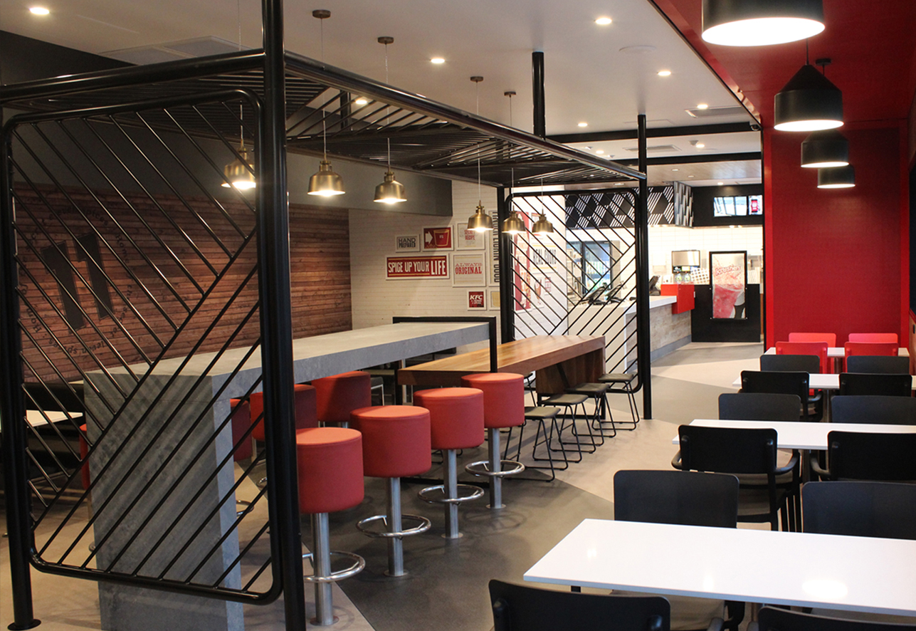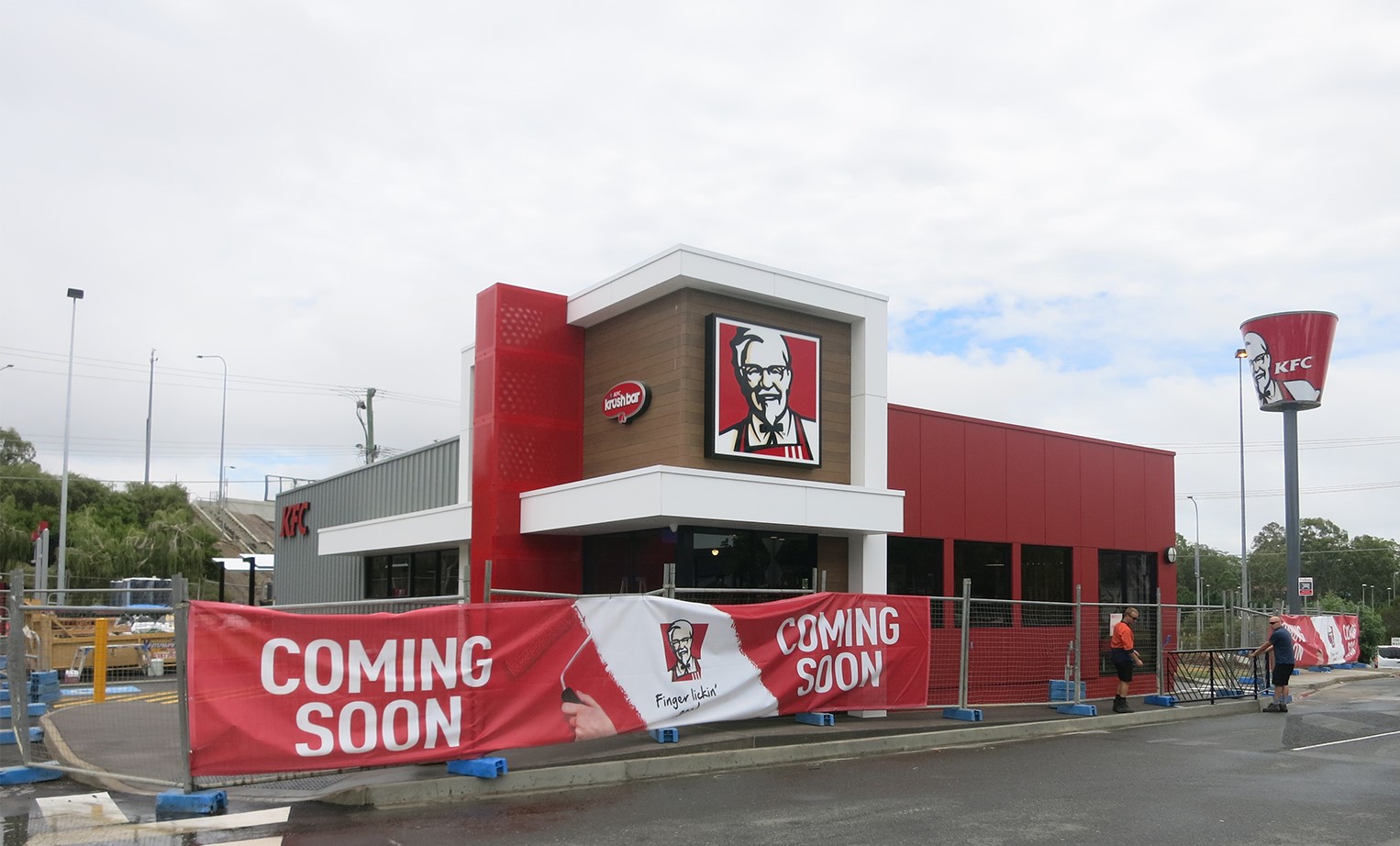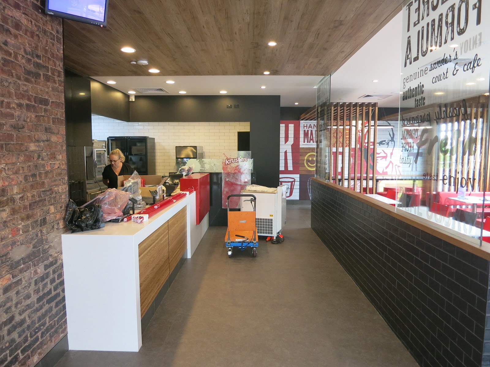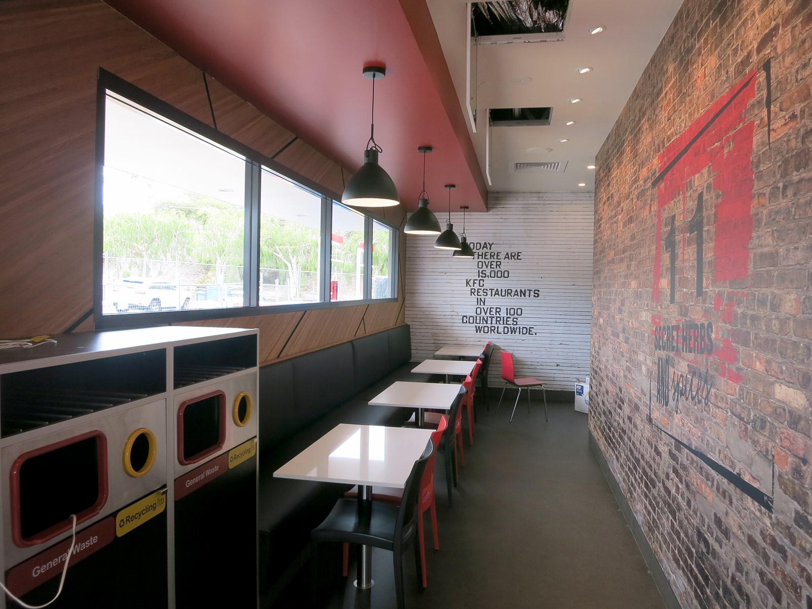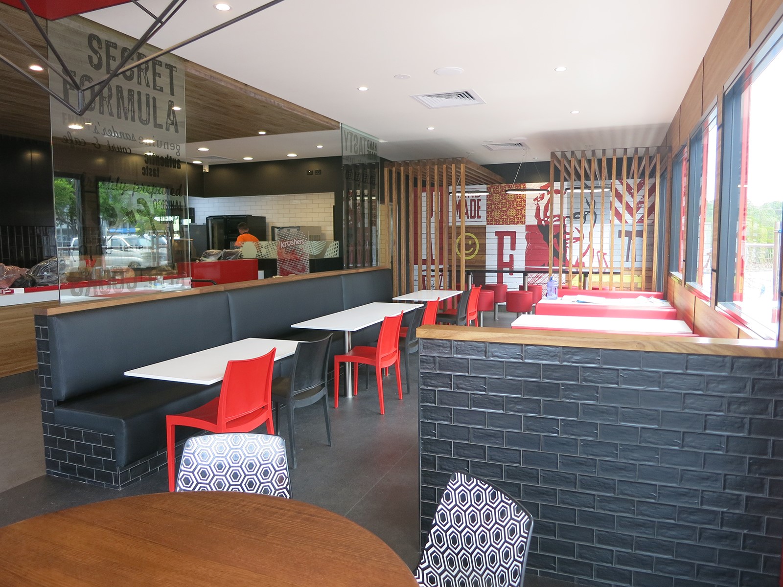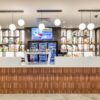
We are thrilled to now release the new KFC look! In September last year KFC Australia asked us to create their new front of house brand standard design. Over the last six months Inaspace collaborated with various designers and architects to create a KFC design guide. This brand new look will be used by all architect and design consultants in Australia working on KFCs. We also created a virtual reality model for the KFC team to walkthrough, including the global CEO.
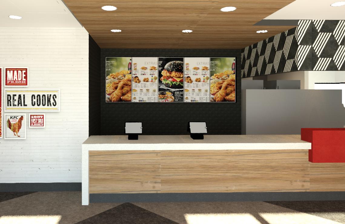
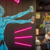
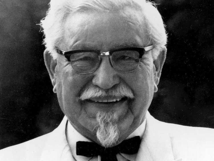
Authenticity was the brief, and we have blended modern finishes to highlight the history of the company. The spotlight is back on the Colonel and the “Kentucky Fried Chicken” brand with new graphics and murals. The signage is a throwback to the original brand with the bucket and stripes.
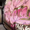
2019 marks 10 years of Inaspace working on KFCs and this project is particularly special. It’s incredibly rewarding knowing that our designs have been recognised, leading us to contributing to the brand on a national scale. The new design will be rolled out across new stores and adapted for existing store upgrades. Be on the lookout for some cheeky hidden quotes and graffiti style murals!
